
Eight Values-Distinct Audiences for Democracy
A test site for future audience framework
Introduction
A brief background to this work
Table of Contents
01. TL;DR
Executive summary
This interactive report answers why climate communications hasn’t delivered on the promise of engaging the masses, who has been left out of the conversation, and how to reach people more effectively. Three key things to know:
Insight 1
An insight
Insight 2
Another insight
Insight 3
Another insight
02. Background
More background on what this audience framework is
03. A New Audience Map
A new kind of audience map based on values and media consumption data
Existing maps see audiences through the lens of those who care about climate change and those who dismiss it. But these maps don’t reveal what people are interested in when not thinking about climate. To build a media strategy that reaches new audiences, and contributes to a better climate future, we need new maps!
People’s values predict where they hang out in media culture. When we group audiences by their values, we get groups of people who tend to listen to the same artists, who watch the same TV shows, and who play the same games.
The map above is the audience framework from the Narrative Observatory @Harmony Labs. The four distinct audiences are derived from Shalom Schwartz’s Theory of Basic Human Values, with four evenly distributed clusters of values that are considered valid across cultures, globally.
The map integrates the media behavior of 300,000+ people in the U.S. across broadcast television, streaming, desktop, mobile, and tablet. We used data from opt-in audience panels, connected with media content data, including television closed captions, online news text, social media posts, videos and transcripts from YouTube and TikTok, metadata, and more. By engineering these two kinds of data into one platform, we gain a minute-by-minute, click-by-click, always-on account of how people move through media.
Strive & CreateWe
MeProtect & Preserve
This heat map shows where people in the U.S. who read news articles online over-index with respect to the 4 values quadrants. Here, we see an entire audience—IF YOU SAY SO—that is least likely to read the news.
04. The Opportunity
This map can also do a bunch of other cool stuff
For example, x, y, and z
05. Democracy & Cultural Profiles
Here's 8 audiences
The four core audiences make a map, oriented to two values axes. The zones between these audiences represent bridges—easily actionable opportunities for expansion beyond a base audience, and into spaces where two different audiences share values. Here, we describe 8 opportunity zones, named for how of each of these audiences relate to democracy, based on their media diet.
info Hover over the graph for more information
Strive & CreateWe
Imagine Democracy
Democracy, OK?
Democracy for Me
Democratic Republic
Democracy as it was
Democracy Please
Democracy for Us
Democracy Now!
People Power
If You Say So
Don't Tread On Me
Tough Cookies
MeProtect & Preserve
Step inside the media life of each audience zone to understand the cultural worlds they inhabit
For the profiles below, we collected real-life media artifacts from opt-in panels of 300,000+ people in the U.S. between January 2022 and December 2022. The profiles include top music, streaming, and brands, as well as how audiences engage with democracy.
touch_app Audience Zone: If You Say So
Values drive how we reason about ourselves and the world
This audience’s autonomy value informs how they engage with social issues like climate in the media. Based on this engagement, we derive how they think about climate, the possibility of change, the future, and participation.
Democracy Maxim
Democracy, OK?
Democracy & Cultural Profiles
Each audience participates in a distinct media culture
Here, we analyzed over 6 million encounters, from broadcast TV, streaming, YouTube, online news, and more, to map the top brands, shows, and music for each of the 8 audience zones. We also include the democracy content these audiences consume.


Democracy Content Close-up
Knowing an audience well requires a fluency in their unique media language, their vibe
A qualitative analysis of democracy-related content identified key narrative elements from stories in each zone. Here, we zoom in on a distinctive piece of media to surface emblematic quotes and features—around setting and themes, heroes and anti-heroes, conflicts and resolutions—that can help form hypotheses for new kinds of democracy storytelling.
06. Storytelling Tips
Strategic starting points for reaching and resonating with every democracy audience
After synthesizing insights from audiences’ media diets, here are a few storytelling strategy hypotheses, tips to get the creative juices flowing. Click on a card to flip it over and see highlights from our actual testing of media concepts, created to validate these ideas (read more about the testing process and these results in the full report). These hypotheses and test results are just a starting point—if this work generates additional inspiration for you, please let us know.
People Power
Superpower
Organizing
Kryptonite
Compromise
Must Haves
Travel and time in nature
Don't Need
Bigger cars, bigger houses, more stuff
Story Do's
Lead with science and reverence towards nature
Story Don'ts
They are already activated, so it’s hard to go wrong here!
CTAs
Volunteering, donating, voting, wielding collective purchase power

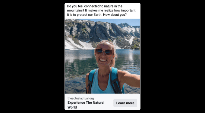
Throughout our testing, People Power gravitated towards nature, whether it was in the ad copy or imagery. Nature themes worked best when they were organic though–virtual worlds didn’t test as well. EVs and ice caps also worked, and bees as long as the tone was positive.
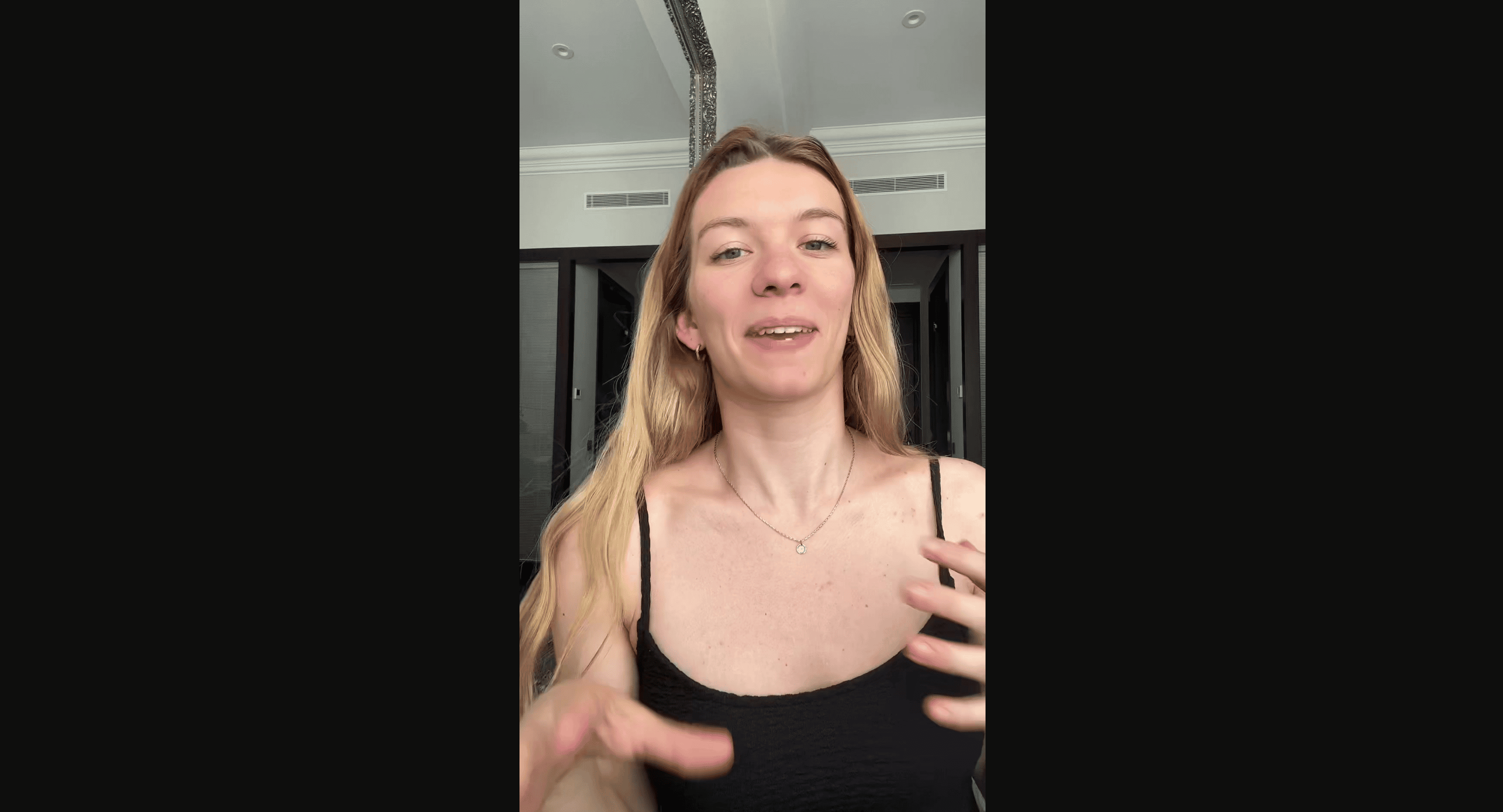
In the example from our testing shown above, TikTok creator Mndiaye_97 has a fun take on bees in this successful co-production.
A question for future tests: what specific types of natural themes work best?
People Power + If You Say So
Superpower
Imagining transformation
Kryptonite
Impatience
Must Haves
Self-care via consumer goods
Don't Need
Individual ownership and super sizes
Story Do's
Emphasize that change takes time
Story Don'ts
Anxiety-inducing content, like maps and data
CTAs
Protesting, donating, liking, sharing, subscribing

This zone engaged the most with messages explicitly about climate but the most successful were those that also included a plan of action.
Throughout our testing the concepts that worked best at transporting this audience—like the TikTok example above where creator Sciammani takes the audience on a culinary adventure full of climate-friendly ingredients—included direct, accessible solutions to the problem.
Another thing that proved effective was showing the data behind any claims being made.
If You Say So
Superpower
Self-expression
Kryptonite
Anxiety and insecurity
Must Haves
The fun and rewards they’re hungry for
Don't Need
Don’t have a lot to begin with
Story Do's
Connect actions to status
Story Don'ts
Anything that feels like a limitation or giving something up for others
CTAs
Training for high status jobs or starting a new trend
For If You Say So, “climate-ness” proved critical in our testing. The most impactful media mentioned climate by name and connected the dots between the things they already care about, like EVs and fashion.
You see this “connecting of the dots” approach in the TikTok example above, where the creator Depthsofwikipedia talks about the climate benefit of traveling by trains.
Another story element that proved effective: a direct call to action.
Tough Cookies + People Power
Superpower
Taking responsibility for themselves and people they know
Kryptonite
Tolerating "Selfish People"
Must Haves
Sense of self-care
Don't Need
Luxury items or experiences
Story Do's
Include humans, even in nature stories; stay calm and curious
Story Don'ts
Hyperbole or escalation
CTAs
Talking to a friend or neighbor or teaching your kids
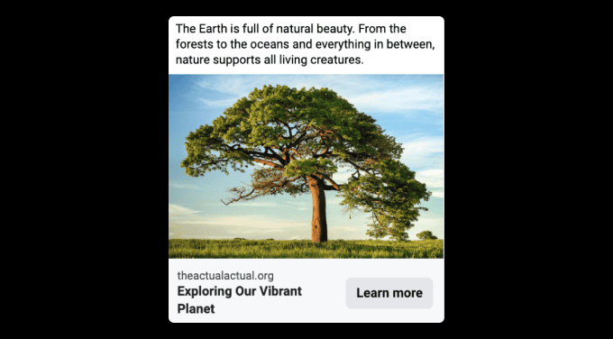
This zone, like this whole “we” side of the audience map, responded favorably to all of the concepts centering the natural world.
The big difference for this particular zone is that even concepts that featured virtual depictions of nature were effective. The example Facebook ad shown above worked with this audience both for engagement and transportation.
If You Say So + Don't Tread on Me
Superpower
Chaos and innovation
Kryptonite
Collaboration
Must Haves
Technology
Don't Need
Fossil Fuels
Story Do's
Keep it unemotional and factual
Story Don'ts
Cynicism or skepticism
CTAs
Doing your own research or disrupting the system
For this zone, the most effective concepts broke the “fourth wall” to make the audience feel personally invested in the outcomes. One successful example of this approach from our testing is the Facebook ad concept shown above.
One thing that didn’t test well was telling this audience what to do, reinforcing the idea that they need to feel agency in crafting the right solution. Tests that included virtual, futuristic settings that helped this tech-forward audience imagine ways in which they might contribute to a better future also worked well.
Tough Cookies
Superpower
Faith
Kryptonite
Chaos, protest, disorder
Must Haves
Loyalty to leaders like pastors, spouses, politicians, and teachers
Don't Need
Comfort
Story Do's
Food and the sacred trust God places in us as stewards
Story Don'ts
Anything that feels adversarial
CTAs
Sharing with a Bible study group, cooking without waste, growing your own food
Tough Cookies were moved most by concepts focused on the wonders of creation. In particular, they were transported by stories of animals, particularly threatened ones.
Creator Markvins successfully tapped into that by featuring the endangered Numbat in the YouTube short above.
Third person narration also tested well; perhaps they like to observe but don’t necessarily want to imagine themselves as part of the problem?
Don't Tread on Me + Tough Cookies
Superpower
Preparedness
Kryptonite
Change
Must Haves
Commitment to purity, non-digital devices, and good ol’ gasoline
Don't Need
Could be willing to give up anything
Story Do's
Emphasize pure and natural origins
Story Don'ts
Anything that feels too novel
CTAs
Eating clean and repairing, not replacing
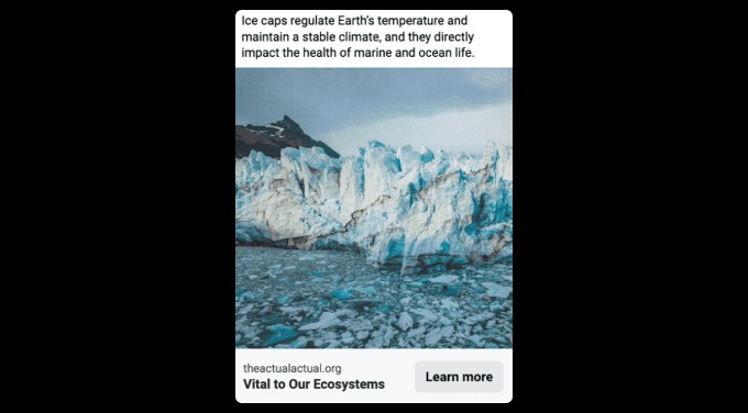
This is another zone where any of the concepts that felt “preachy” caused backlash. That’s not to say they aren’t reachable. The concepts that tested best presented climate issues in a neutral and instructive way.
For example, the Facebook ad concept shown above both engaged and transported this audience—even with a message about something as iconic of climate advocacy as ice caps—when it was delivered with an informative tone.
Don't Tread on Me
Superpower
Strength and strategy
Kryptonite
Compassion
Must Haves
Personal ownership of power sources
Don't Need
Fossil fuels
Story Do's
Emphasize benefits to humans
Story Don'ts
Anything that feels like subordination to nature
CTAs
Generate your own power, prep for severe weather, steward land
Here, first-person approaches that included the audience directly in the story were the most successful. YouTuber Mr. Beast is an exemplar of this approach; the #teamseas video above worked particularly well transporting this audience.
On the other hand, some concepts we tested had a negative effect on Don't Tread on Me's. While they may embrace off-the-grid living, all of the ads tested that had anything to do with buying EVs caused backlash.
07. Key Takeaways
Moving forward on climate means reaching more people with an inspiring vision of the future
-
Democracy 1
Yes
-
Democracy 2
Yes
-
Democracy 3
yes
-
Democracy 4
Yes
-
Democracy 5
yes
Call to Action
Have an idea of how to use a culture-first approach to change the course of our democratic future?
08. Methods & Acknowledgements
One-of-a-kind data infrastructure and rigorous research
To measure the audience values for this research, we use surveys that explore attitudes on race, gender, place, and class, along with core values. Using these results, we develop a suite of predictive models that help us assign audience scores to our nationally representative, opt-in media consumption panels, based on demography, geography, and lifestyle features (e.g., age, gender, race, zip code).
In other words, we don’t survey people about their media habits; we survey them about what they believe, and then we use rich clickstream and watching behavior data to find out what media they engage with. Media consumption panels give us visibility into the minute-by-minute media behaviors of over 300,000 people in the U.S., who opted in and are compensated for their participation, across desktop, mobile, tablet, and TV.
We found the media and climate content that was most popular and distinctive to each audience using models of audience reach. We primarily used websites visited, digital news consumption, and YouTube consumption, between January 1, 2022 and December 31, 2022.
Popular vs. Distinctive
One feature of our analytic approach is our focus on audience distinctiveness in selecting media. We are often asked why we don’t simply use popularity. The reason is that the big stuff in media is so much bigger than everything else that it tends to reach most everyone, creating a less informative map of audiences, and leading to less efficient strategies for reaching audiences.
By way of illustration, during our study period, the highest reach YouTube creator for most of the audience map was Markiplier. So, if a partner does a collaboration with Markiplier, they will reach lots of folks in their target audience, and lots of other people, too. This would be inefficient.
Weighting popularity and audience distinctiveness together, however, reveals how high-reach creators like CoryXKenshin, for instance, more precisely reach If You Say So.
Frequently Asked Questions
All the media data in the Narrative Observatory come from commercial partners who donate their data to this work. This community of data philanthropists includes big companies, like Nielsen and Comscore, and also smaller startups, like Peakmetrics, that are scraping different corners of the web, news, television, radio, and other kinds of media. We are grateful to them for supporting the Narrative Observatory.
We estimate membership in each of the 8 audience zones using big values surveys and predictive models. We have a good guess about audience membership for every person in the anonymous panel who has supplied demography, lifestyle characteristics, and geographic information.
To identify “climate relevant” media, we used keywords, human annotation, and natural language processing tools to create predictive models of climate “adjacency.” The models filter out things that aren’t really about climate change (e.g. “workplace climate”) and extend to include things that often co-occur with climate change, without mentioning climate specifically (e.g., “Earth,” “natural resources,” “extreme weather”).
We used the climate relevant media across news and YouTube (more information on how we identified these here), and found the content that was statistically significantly associated with each audience zone. That is, we did not focus on the “most common” content per audience zone, but rather which channels and news themes were connected to each audience most uniquely.
We then filtered content down to a select list of highly distinctive media, and employed a qualitative approach led by a cultural analyst. Analysts consumed each piece of media and looked for tone and texture, characters, story arcs, and other emergent trends to identify strategically important signals and patterns that emerged across the most engaging content for each zone.
Then, the team of technical and qualitative analysts met to produce a final articulation of features.
Because qualitative analysis always involves some subjectivity, we created new material that captured our hypotheses from the qualitative work and tested it using randomized controlled trials to confirm (or refute) our intuitions about what story elements mattered the most.
Acknowledgements
About
Harmony Labs
Harmony Labs researches and reshapes society’s relationship with media, using science, data, and creativity. For more than a decade, our work has helped storytellers and strategists, decision makers and dreamers, harness the immense power of media to shape a positive, pluralistic future. Learn more about our media research lab here.
More from the Narrative Observatory @Harmony LabsResearching and reshaping our relationship
Researching and reshaping our relationship
with media
In partnership with advocacy organizations, philanthropic foundations, entertainment and news media brands, and creators, the Narrative Observatory has helped shape the cultural strategy and media making of dozens of partners to-date. You can explore some of this work below:
How to Reach New Climate Audiences
- Partner: Earth Alliance
- Climate
- Interactive
- Audience
A Home for Every Hero
- Funding: Pop Culture Collaborative Partner: Gutsy Media
- Fandom
- Interactive
- Gaming
- Narrative
- Audience
Audiences for Poverty Narratives in the U.S. Media
- Funder: Bill & Melinda Gates Foundation
- Economic Mobility
- Audience
- Narrative
Health Equity Narratives: Strategy Validation
- Funding: Robert Wood Johnson Foundation Partner: Story Strategy Group
- Health Equity
- Interactive
- Content Testing
A Day In the Life: Poverty & Economic Narratives In the Feed
- Funder: Bill & Melinda Gates Foundation
- Economic Mobility
- Interactive
- Narrative
Poverty Narratives: Trends Over Time
- Funder: Bill & Melinda Gates Foundation
- Economic Mobility
- Interactive
- Narrative
If you’re interested in learning more about the Narrative Observatory and how it might be leveraged for your work, get in touch.